Wegmans Smart Cart
The Shopic smart shopping cart by Wegmans is an innovative solution designed to optimize the grocery shopping experience for customers. However, the current interface presented limitations and areas for improvement. This project aimed to enhance the Shopic Cart interface, streamlining the checkout process while providing users with a seamless and enjoyable shopping journey.
Role
Timeline: January 12 - March 24
Year
Spring 2024
Tools
Figma and AfterEffects
Overview
The Shopic smart shopping cart by Wegmans is an innovative solution designed to optimize the grocery shopping experience for customers. However, the current interface presented limitations and areas for improvement. This project aimed to enhance the Shopic Cart interface, streamlining the checkout process while providing users with a seamless and enjoyable shopping journey.
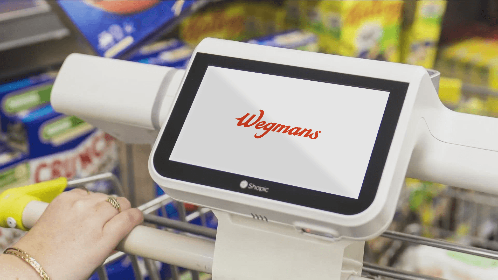
Device Overview

The Problem
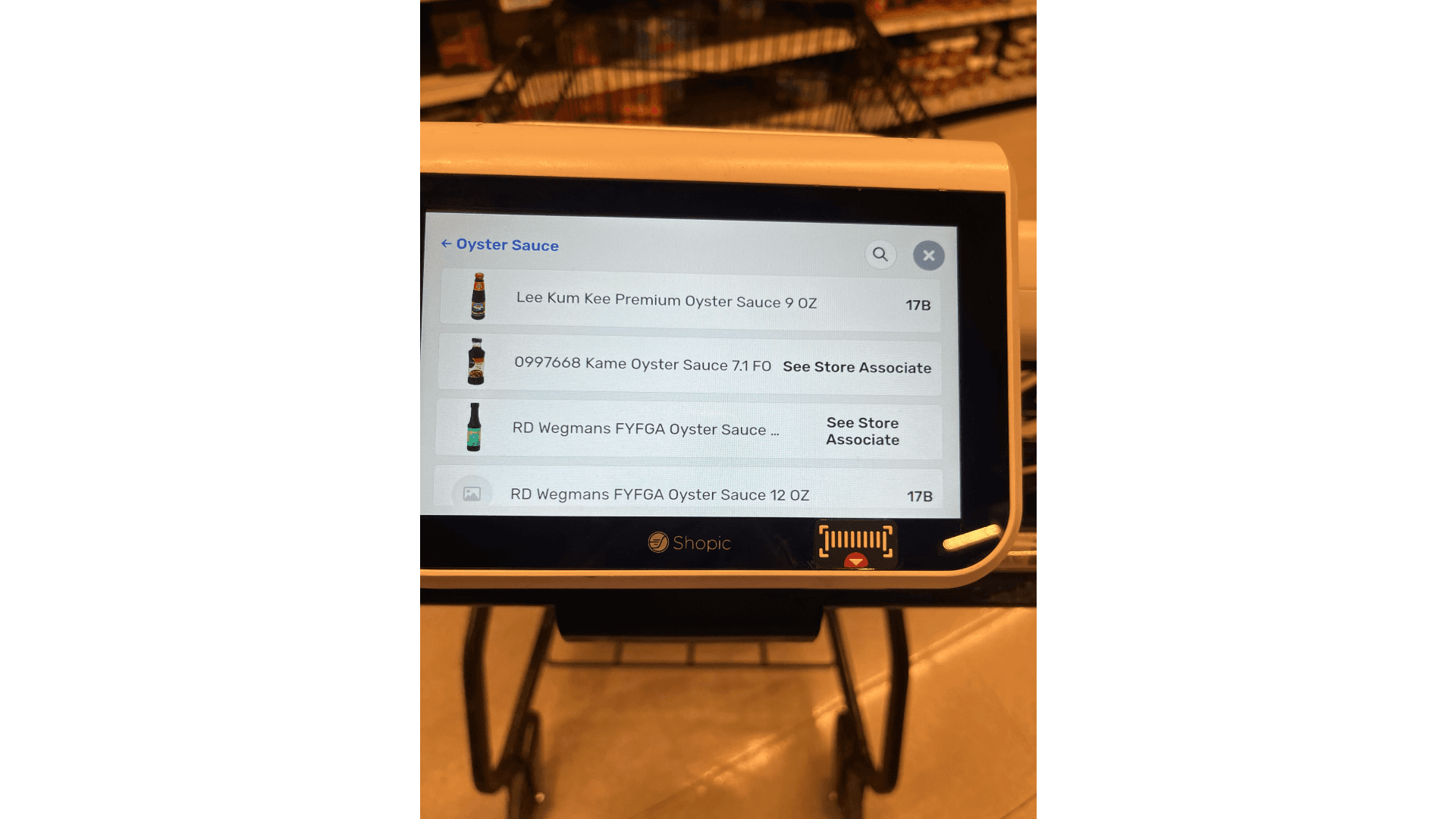
After doing a heuristic evaluation conducted on the Shopic Cart interface I found revealed several usability issues and pain points for users. Key problems included a lack of visibility into system status (with in the UI), inconsistent naming conventions for products, limited user control and flexibility, and inadequate error prevention mechanisms. Additionally, the absence of integrated help resources and clear documentation made it challenging for users to recover from errors or confusion during their shopping experience.
Design principles and goals:
Heres what i'm aiming to fix on the project!
Intuitive navigation: Empowering users with familiar patterns and gestures to reduce cognitive load.
Seamless integration with account: Minimizing friction points and ensuring a fluid experience from browsing to checkout.
Clean, minimalist aesthetic: Prioritizing decluttering, visual hierarchy, and reinforcing Wegmans' brand identity.
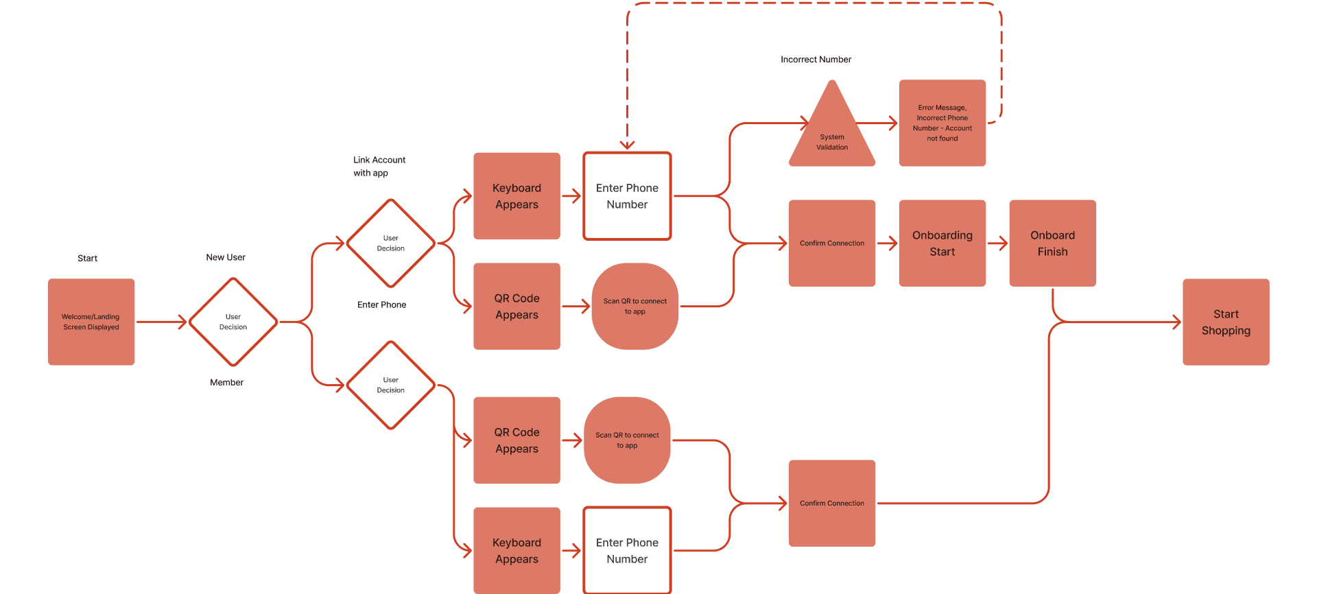
Refined Entry User Flow
Lets start with sorting out the user flow for the problem areas i'll be focusing on. Heres a guide to what each element represents.

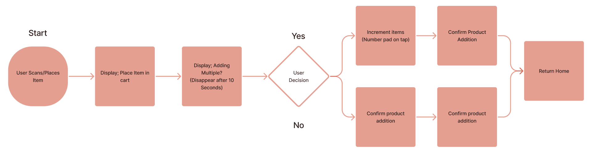
Refined Add Item Flow
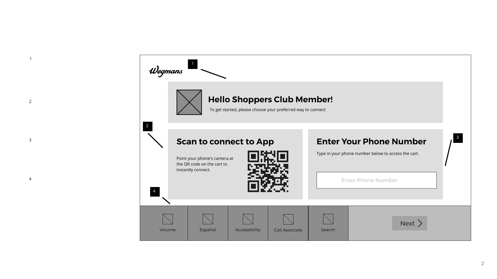
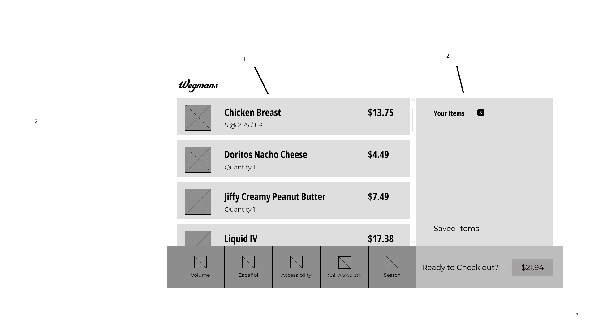
Wireframes
Here are a few wireframe solutions that I knew would allow the user to get to where they needed to on the device with out as much friction.
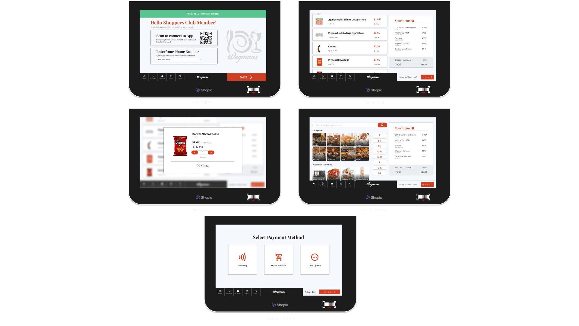
Visual Design
Color palette inspired by Wegmans' vibrant reds, warm yellows/oranges, and trustworthy blues/greens.

Moodboard capturing Wegmans' welcoming, reliable, and authentic brand personality.

Typography choices balancing elegance (Playfair Display for headings) and legibility (Open Sans for body text).Adherence to Wegmans' established design language for iconography and UI elements.
Design solutions:
Improved search and filtering capabilities for more efficient item location.
Integrated help and documentation resources, accessible directly from the cart interface.
Streamlined checkout process with multiple payment options, including mobile wallet integration.
Clear error prevention mechanisms, such as confirmation prompts and visual indicators.
Consistent product naming and visuals, aligned with real-world item names and high-quality images.
Key Takeaways:
Conducting thorough user research and usability evaluations is crucial for identifying pain points and areas for improvement.
Adhering to established design principles and brand guidelines ensures a consistent and recognizable experience.
Prioritizing user needs and addressing them through thoughtful design solutions can significantly enhance the overall user experience.
Continuous iteration and user testing are important for validating and refining designs to meet evolving user expectations.
The Result:
The redesigned Shopic Cart interface addressed the usability issues and pain points identified in the research phase. The implementation of intuitive navigation, seamless integration, and a clean, minimalist aesthetic enhanced the overall user experience, fostering trust and satisfaction throughout the shopping journey.